PencaliP14
Pencali
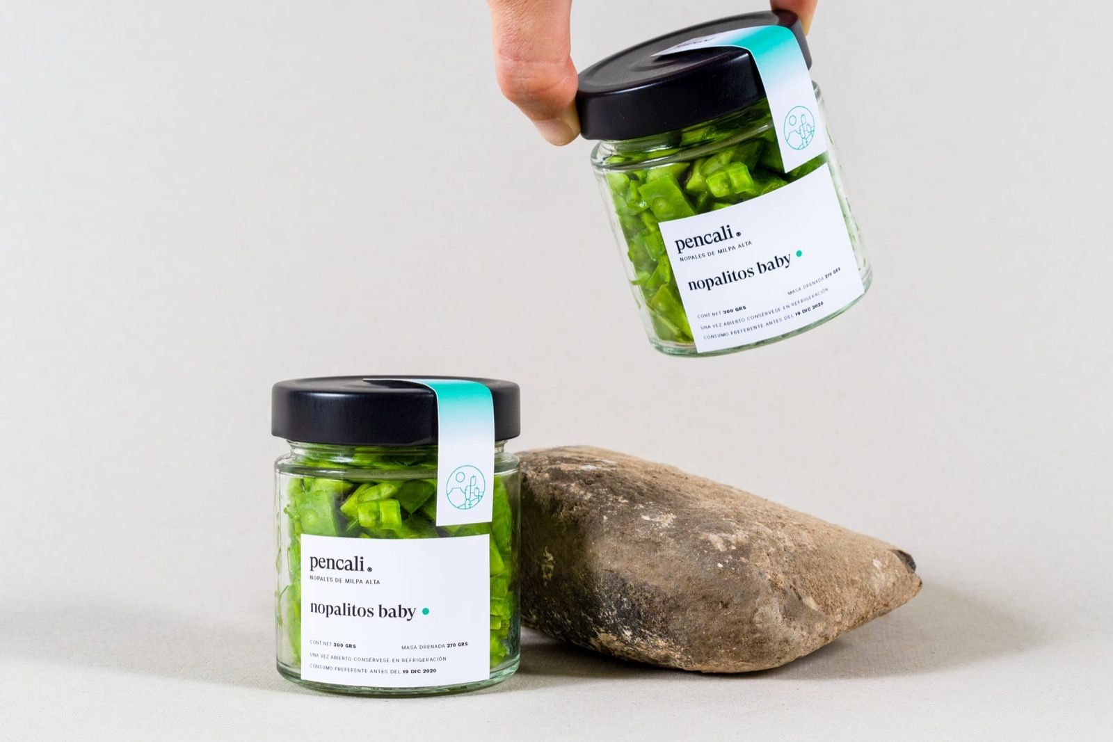
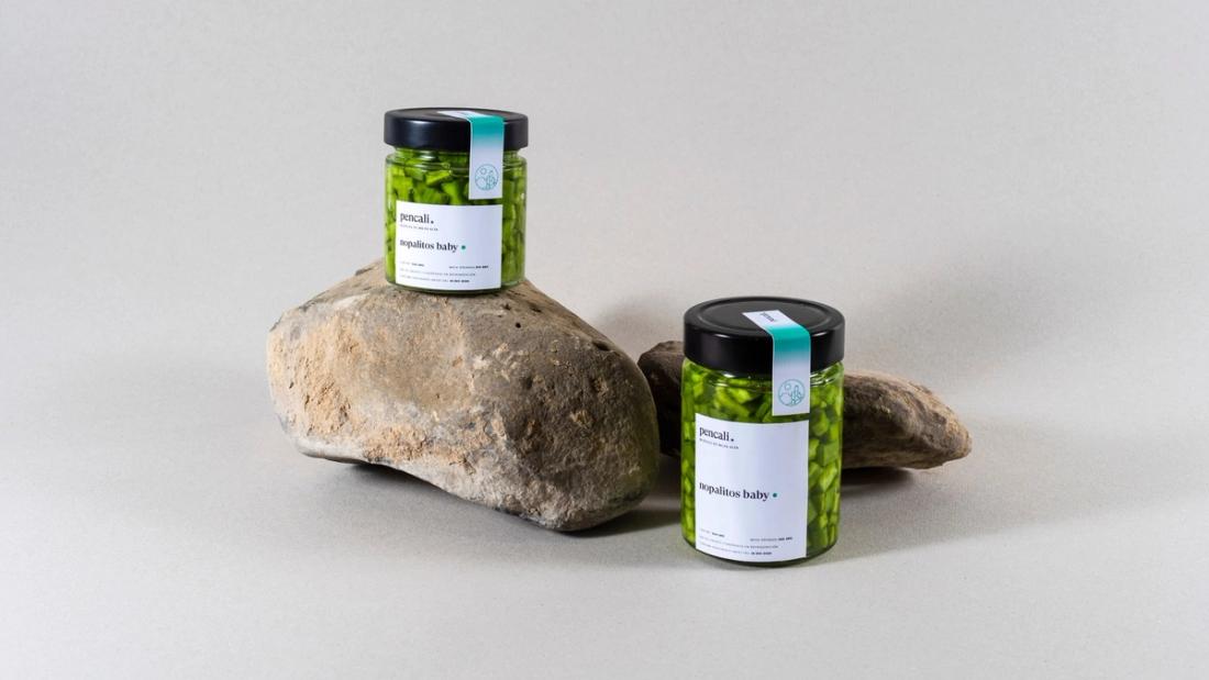
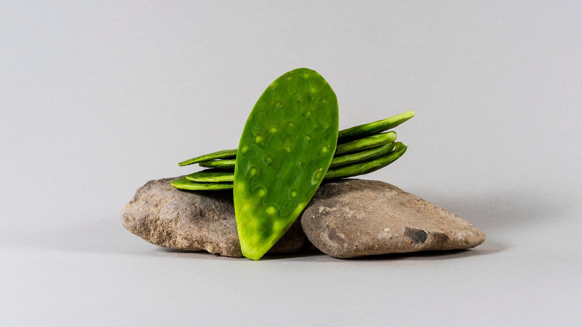
Pencali is a gourmet and organic brand of nopal grown and harvested in Milpa Alta, México, the most important region in the country for this edible cactus. Nopales have a powerful symbolic meaning for Mexican people, associated with national identity and the arid lands of the semi-desert; the challenge was turning this product into a singular, high-quality brand.
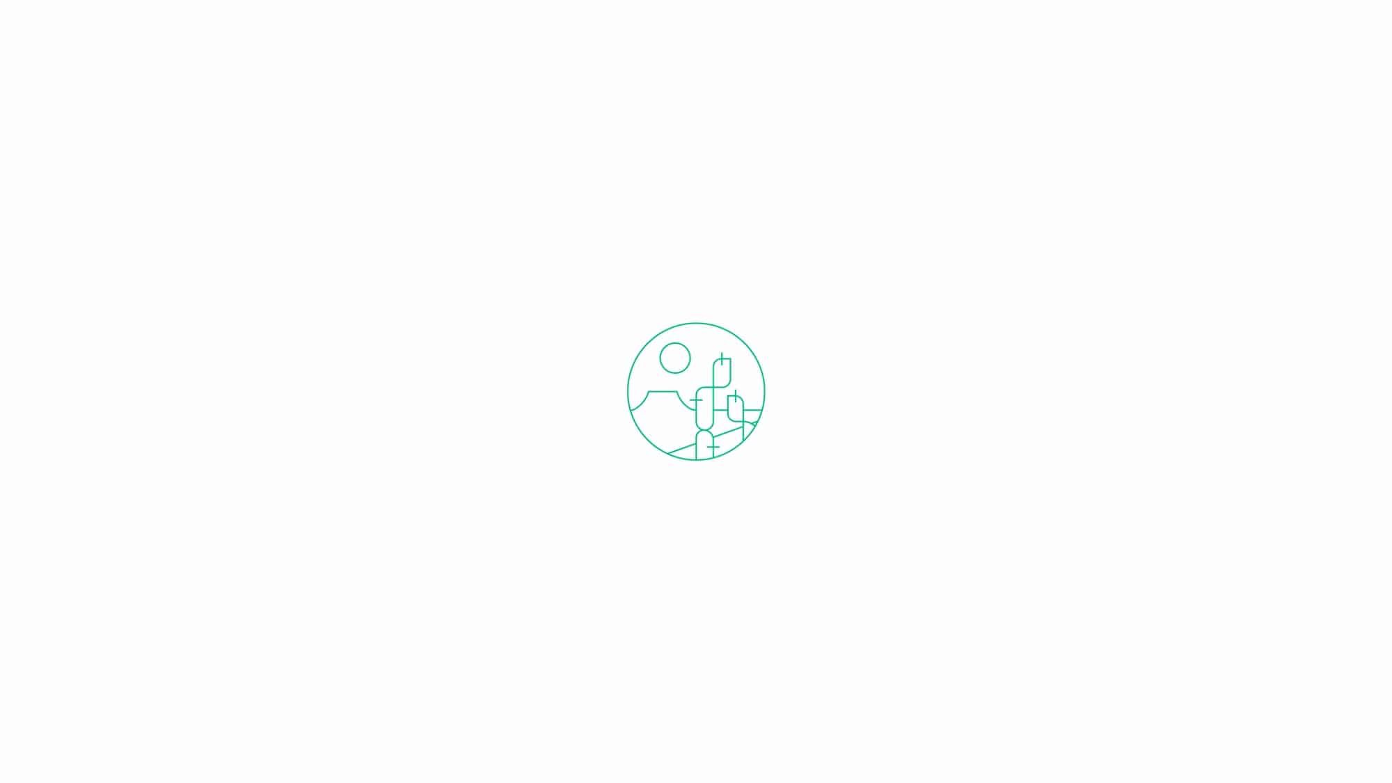
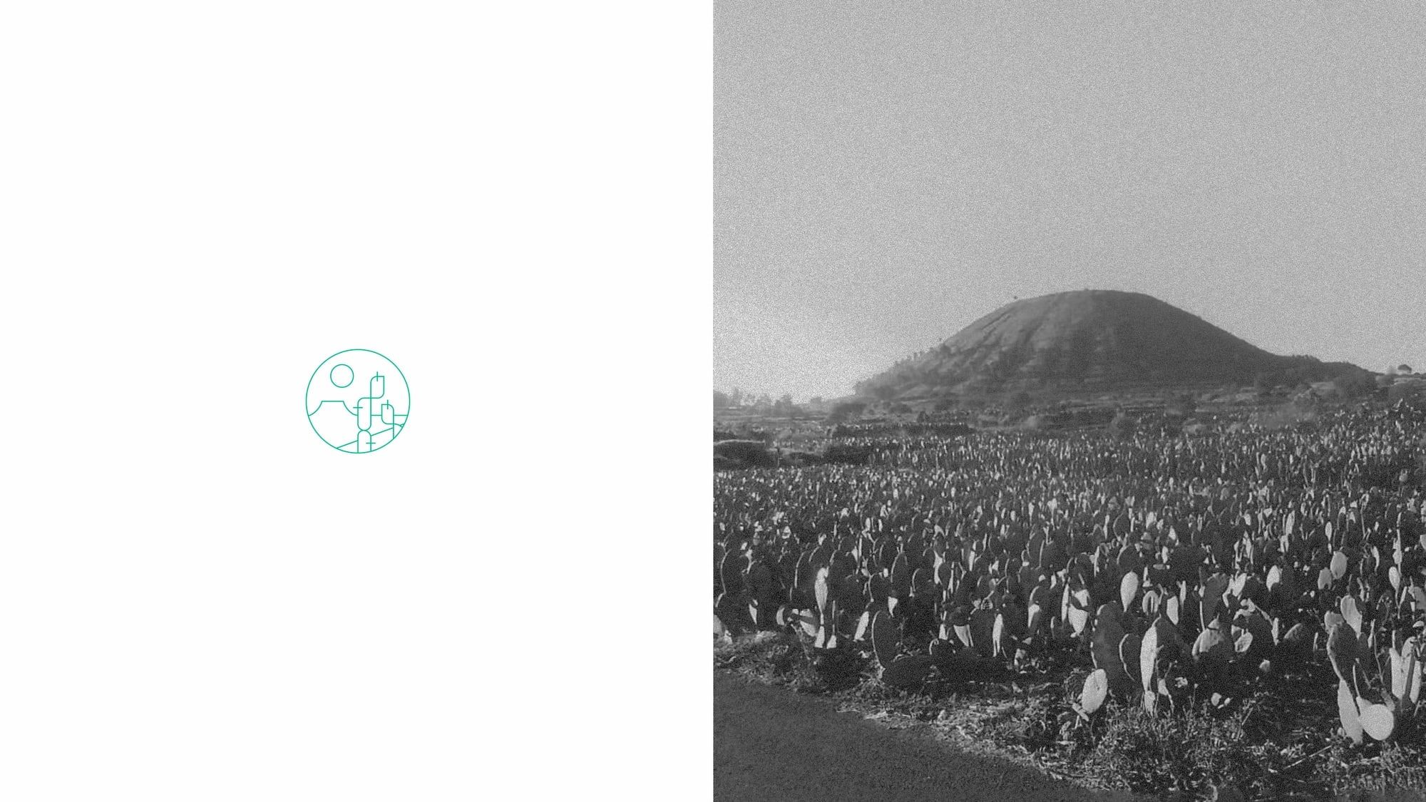
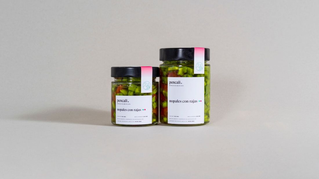
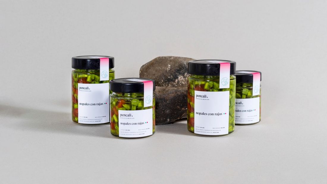
The name joins the Spanish word "penca" (from the Latin pedis, "foot") with the Nahuatl word "calli", "house". Pencali is, thus, "the house of leaves". The icon is based on Milpa Alta's distinctive plateau.
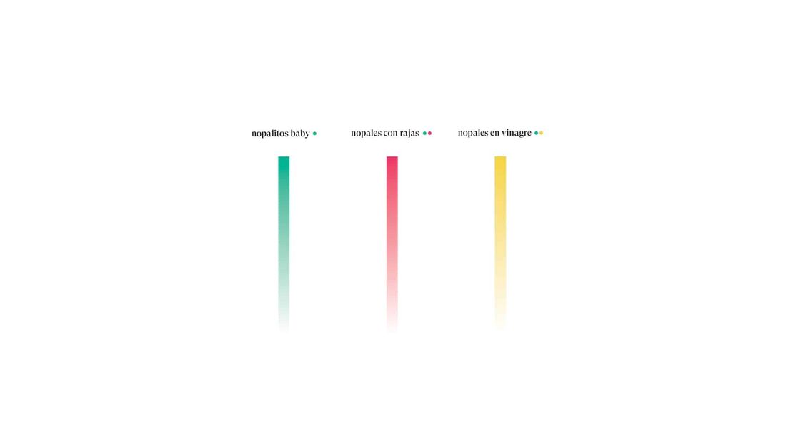
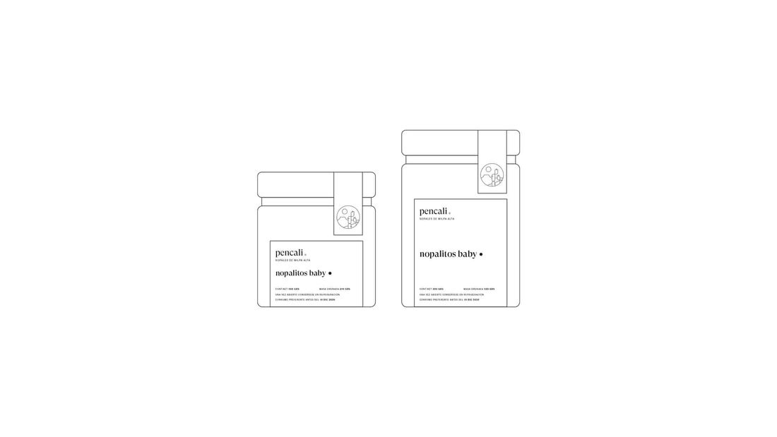
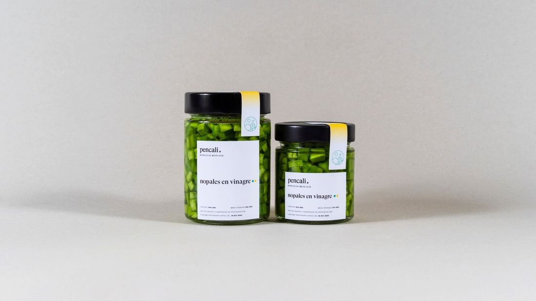
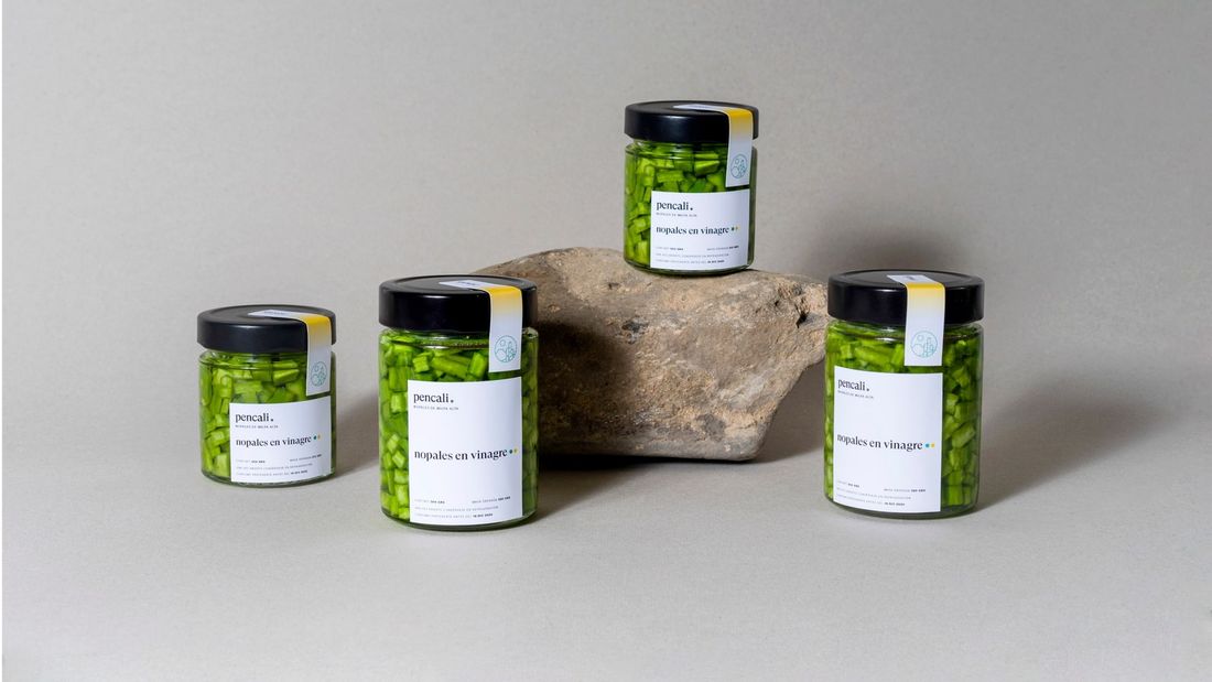
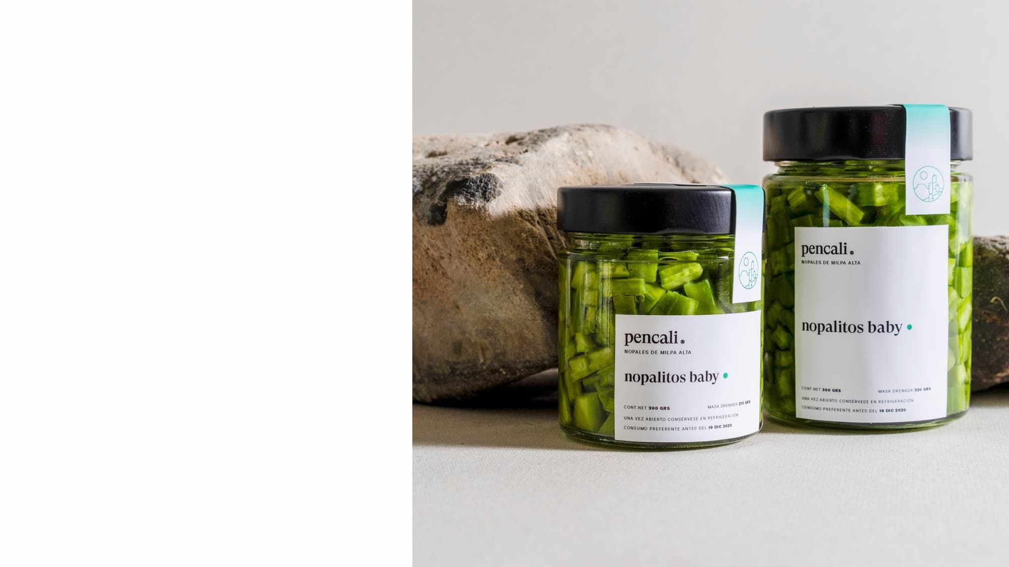
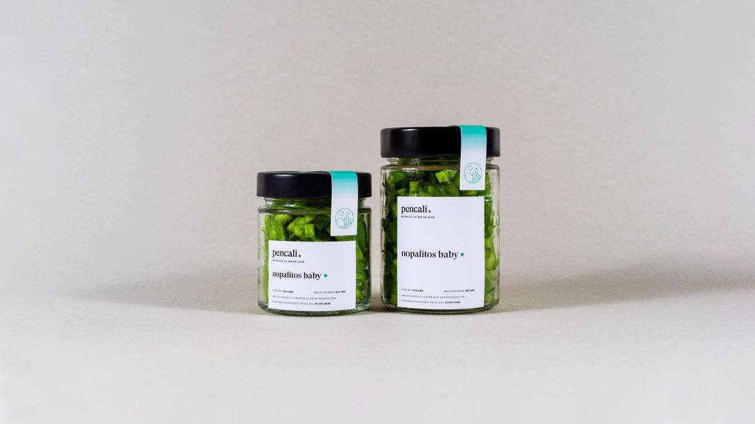
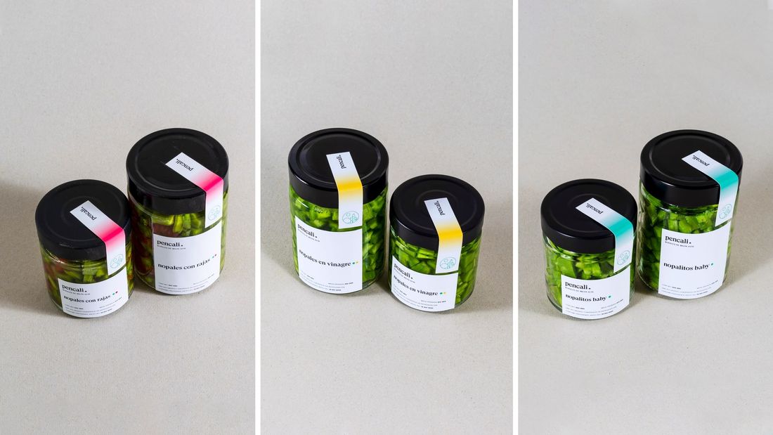
All labels and packaging were designed on a simple white canvas to avoid the Mexican clichés associated with the imagery of the nopal, with a color system that distinguishes each type of preparation.
Tundra
Running club. Full visual identity